Skin Kandy
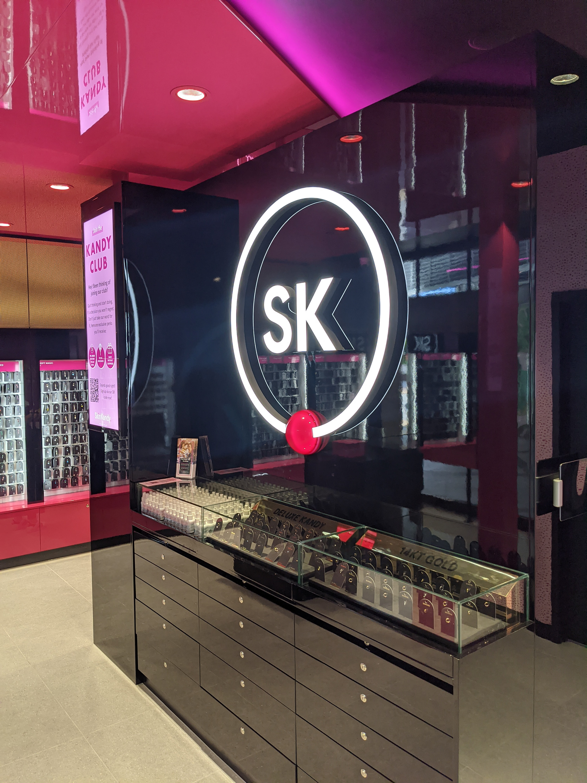
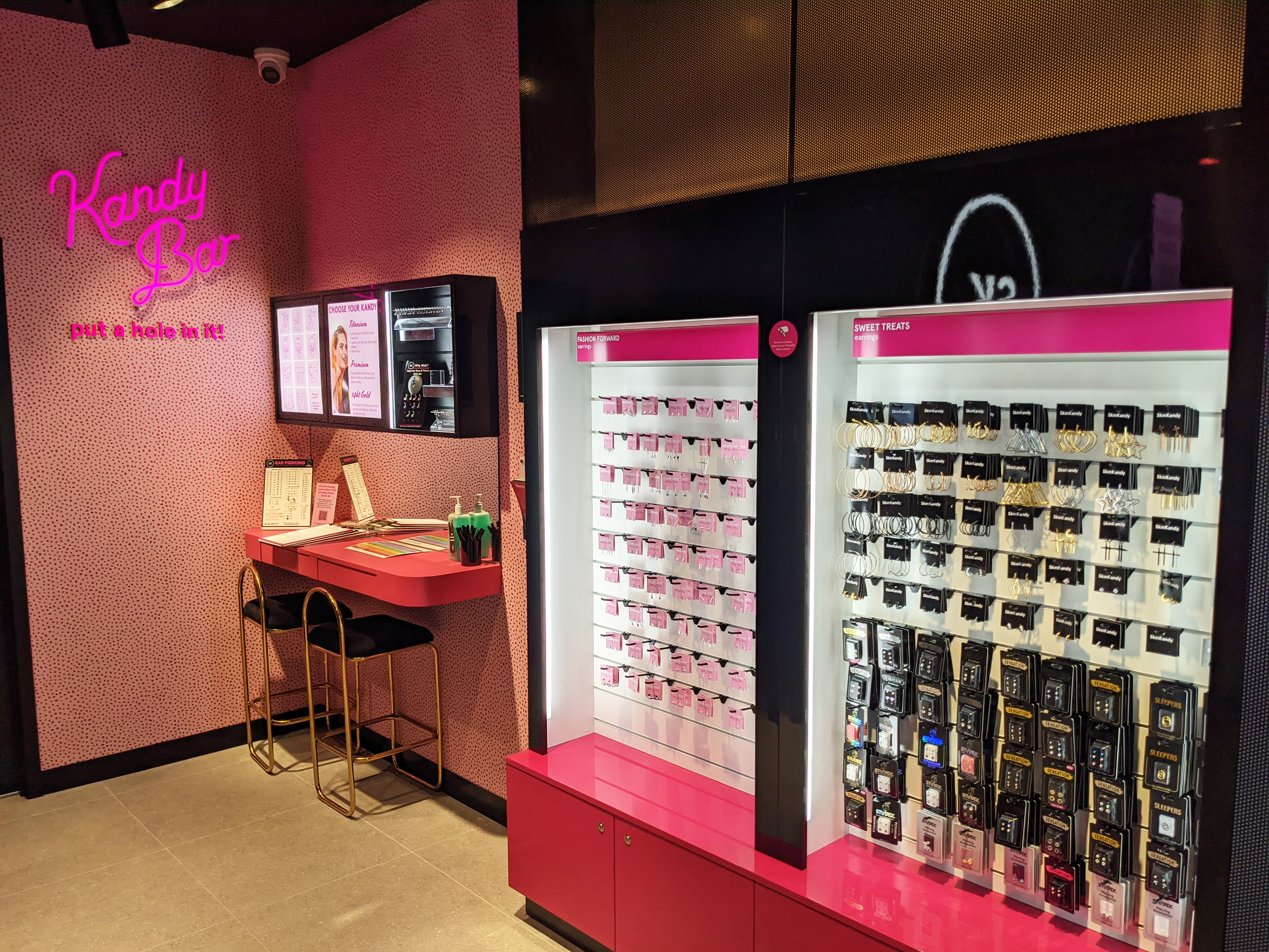
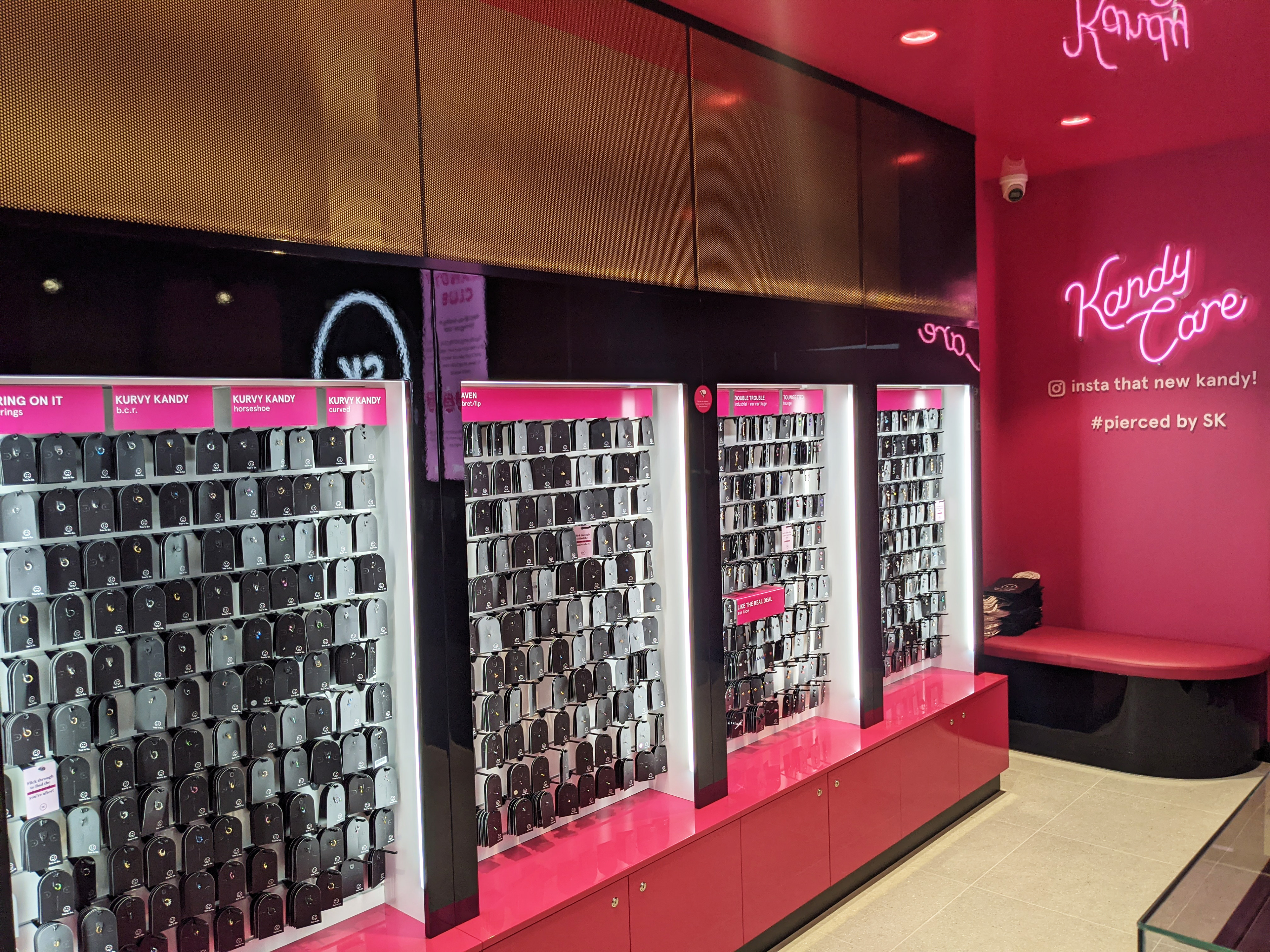
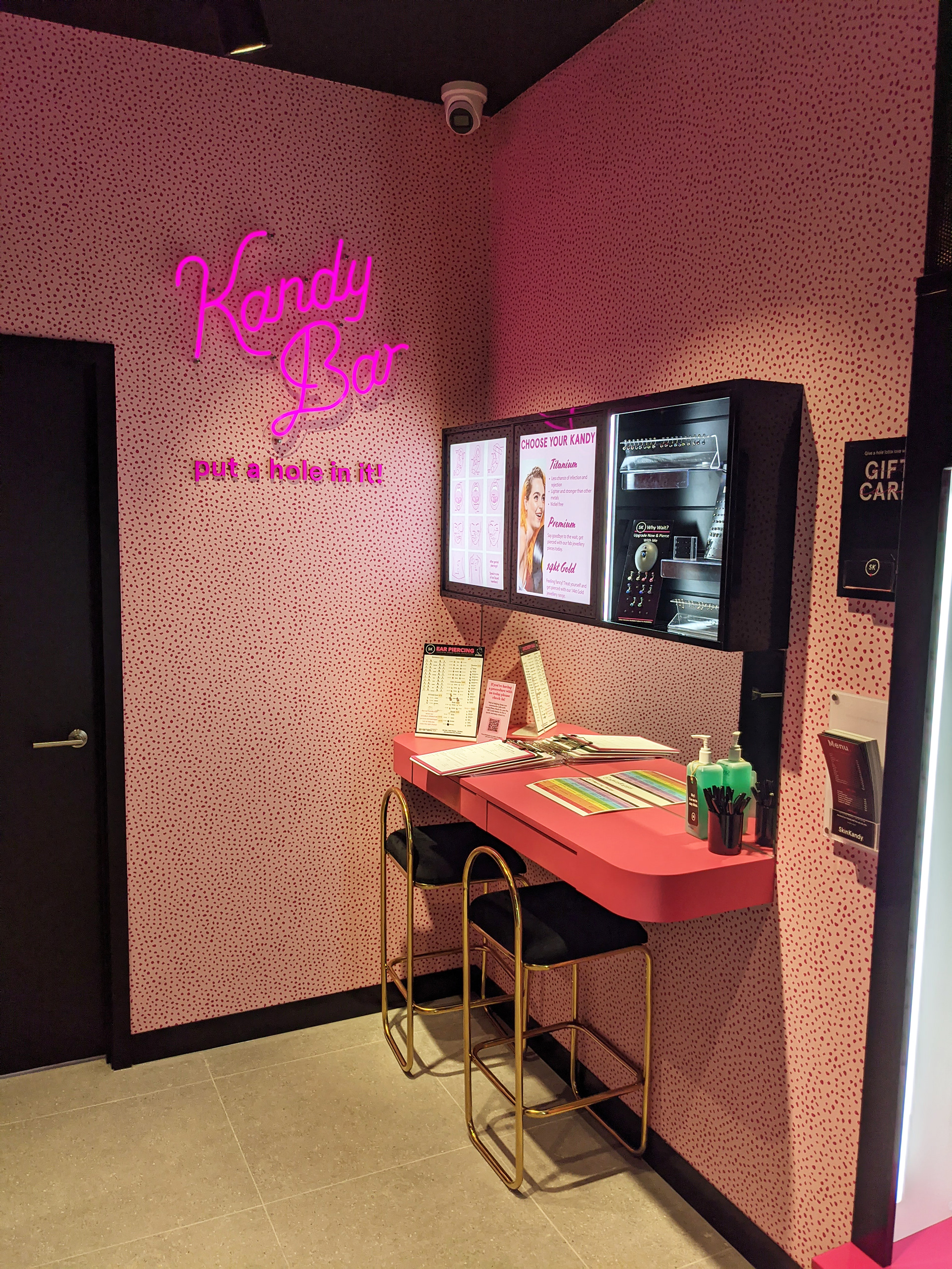
New Store Design Concept Maroochydore 2020 Skin Kandy’s brief was to design a revamp of their stores whilst maintaining their existing brand colours of hot pink and black. Following a critique of one of their latest stores, I provided my recommendations to evolve the store design and improve their customer experience. This project gave us fun and colour during the deepest darkest stage 4 lock down in Victoria in 2020 and is a testament to what can be done with modern technology, as all design was completed remotely with many a zoom meeting had to share screens! A key element of the brief was to develop the customer experience, in response to this I removed the large cash desk and developed destination zones for the customer’s piercing journey. First up is the Kandy Bar where you go to have your piercing consultation with the SK team member, following this and your treatment you then go to Kandy Care where you are provided with aftercare information, finalise any payment transactions and finally utilising the pink backdrop with the neon Kandy Care sign and the call to action “insta that new kandy!” take a selfie and post it on your social with #piercedbysk tagged! In addition to these zones, I also included a multipurpose central joinery unit that houses the premium range of jewellery and a black gloss wall at the front for a large brand statement, at the rear is the key storage area, and the POS has been condensed to the side. In addition to these functions the central unit has also been designed to stops views into the treatment rooms, providing an added layer of privacy for customers during their piercing journey. The Skin Kandy brand colours are hot pink and gloss black, to modernise and soften this pallet I added in a soft pastel pink, this was used as a background colour in the hot pink dalmatian spot wallpaper to the back wall of the store, as well as in the treatment room flooring and to a feature wall in the treatment room to add some brand personality to this area. In addition to the soft pink, I also modernised the main store flooring spec, opting for a large 600 x 600 raw concrete floor tile. Finally, I revamped the wall bays and floor displays by developing sub-categories to assist the customer with self-selection, building on the Skin Kandy brand I had fun creating names for categories such as Midriff Magic for belly button piercing jewellery and Tik Tops for tops and dermal jewellery. The completed design is a true reflection of the Skin Kandy brand, it is a fresh fun design that appeals to their key Gen Z demographic and provides the ultimate piercing customer experience. It not only is a beautifully design store but has also proven to be effective in sales; with the addition of the Kandy Bar zone, the upgrades to premium piercing jewellery during the initial consultation has increased by 300%.